Wendy’s website redesign
we launched a full redesign of the wendy’s website in 2017.
Screenshot of the Wendy’s homepage in 2017.
THE impact
The 2017 redesign drastically improved functionality and sales, resulting in a same-year ROI.
Above: Old Wendy’s homepage (ft. unlabeled navigation).
Below: New Wendy’s homepage (ft. labeled navigation).
THE WORK
The redesign optimized a happy path to mobile ordering & enhanced site navigation.
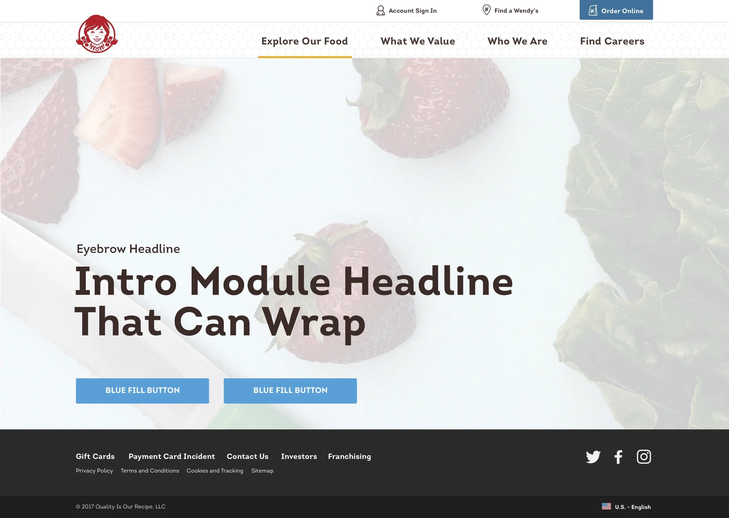
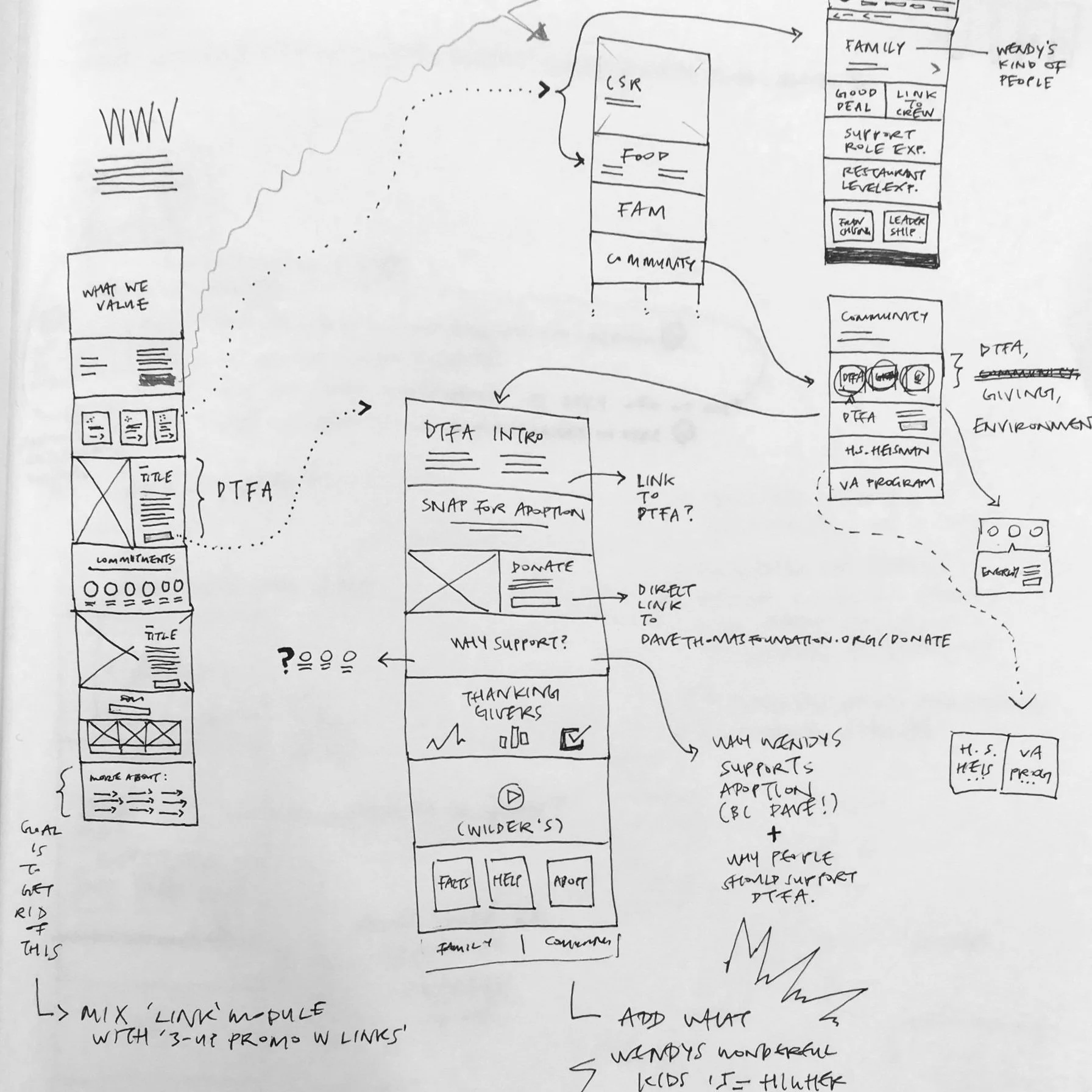
Final outputs included a visual refresh, website restructuring, and module library to simplify the process of supporting ever-changing campaign materials and other content changes from marketing.
Above: Screenshot featuring “Intro Module” in the Module Library.
Below: My sketches of the Module Library.
Sketch of module types & variations.
Sketch showing how modules can stack to create pages.
MY CONTRIBUTION
I was involved in the full lifecycle of the project.
I was 1 of 3 designers on the “dotcom” team responsible for the website redesign. The other members of the UX team dedicated their time to updating the Wendy’s app and in-store kiosk experience. My role included leading workshops with stakeholders, assisting with preliminary research, sketching wireframes, creating prototypes, checking ideas through usability testing, integrating findings into workable designs, cutting final assets, and supporting the development team with final implementation.
I saw the project through multiple iterations leading up to launch and next-phase releases after launch.
Above: Lo-fidelity screens showcasing the power of stacking modules.
Below: Exploration of site reorganization.
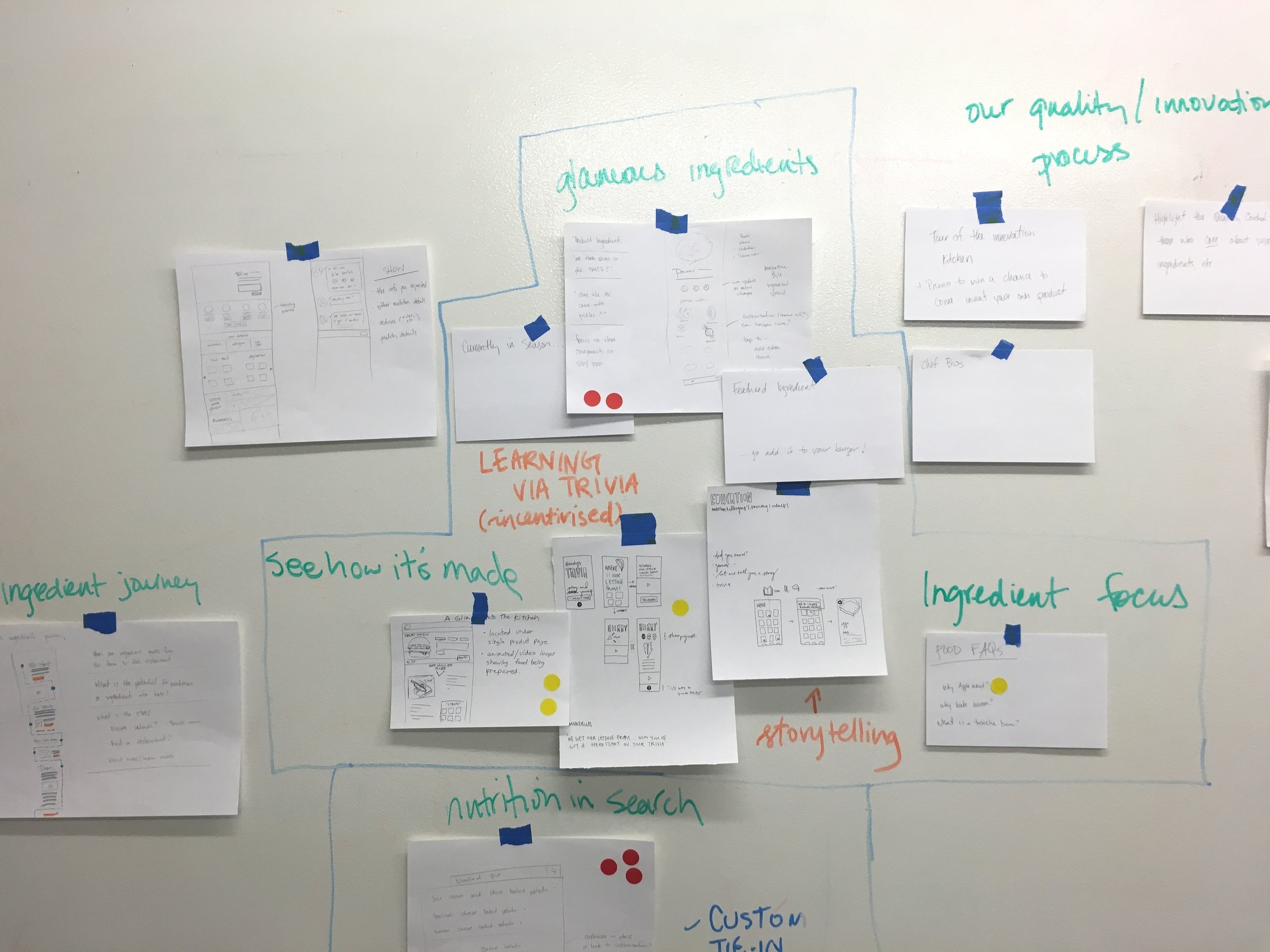
Photo from stakeholder workshop.
The map I created to help participants find us (90º Labs) after parking.
Photo from user testing.
highlight of my contributions
interactive design & ideation
ft. design proposal to showcase the power of storytelling
Above: My sketch exploring interaction details, designed to trigger upon scroll.
Below: The design proposal—created by a design colleague & myself.
visual design
ft. new navigation for the 2017 redesign launch
Above: Navigation I designed for launch, taking inspiration from the honeycomb-inside of the wrapping that covers Wendy’s burgers.
Below: Documentation outlining Navigation at the mobile breakpoint.
ux design
ft. new “contact us” page
Above: Desktop breakpoint of the new “Contact Us” page, which elevated first-call resolutions from 5% to 90%.
Below: Mobile breakpoint showing the List View (left) and Map View (right) to specify a restaurant to contact.


